
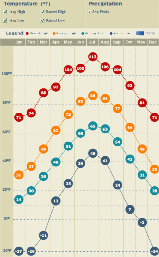
Amy and I were wondering how the average temperature differed between Fairport (where I grew up) and Downers Grove (where we live now). I found graphs showing this on weather.com, Fairport & Downers Grove.
Then I became curious if I could make an animated gif to alternate the two images. I found GIFfun from Stone Design to do that.
On the graph below red is the record high, orange the average high, light blue the average low, and deep blue the record low. Downers Grove is the one with warmer summers, including a July record high of 105 - click on the image to see the bigger version.
Here is the same comparison for Peoria and Benton, KY - Benton is warmer.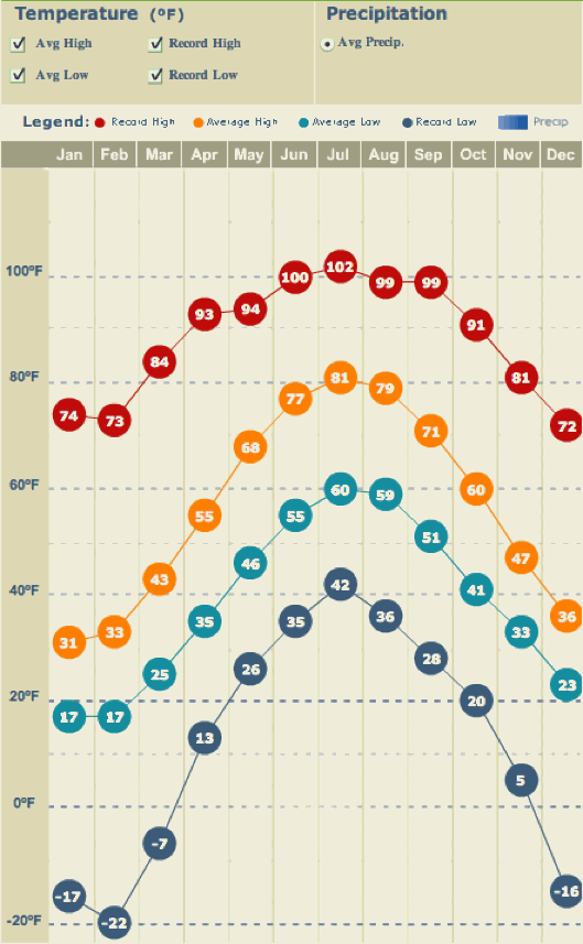
Friday, April 25, 2008
City vs City Temperatures
Subscribe to:
Post Comments (Atom)
No comments:
Post a Comment